info@dolcesuono.com
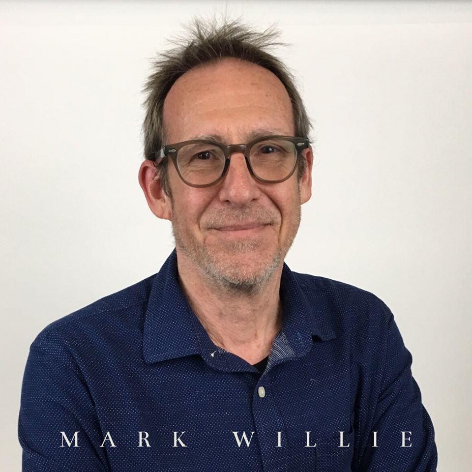
DSE Feature on Mark Willie, Graphic Designer
March 31st, 2020
 Dolce Suono Ensemble welcomes Mark Willie, our illustrious graphic designer, as our featured artist. Get to know Mark through his bio and his words, and learn about the design process that led to the handsome logo we’re using to celebrate our 15th anniversary.
Mark Willie is Associate Program Director and full teaching professor in Graphic Design at Drexel University’s Westphal College of Media Arts & Design in Philadelphia, and former partner in WFGD Studio design office in Center City. His work has been recognized by the American Institute of Graphic Arts (AIGA), the Art Directors’ Club of Philadelphia, Graphic Design USA, Creative Quarterly, the Society of Environmental Graphic Designers (SEGD) among others. Mark is president emeritus and a fellow of the Philadelphia chapter of the American Institute of Graphic Arts and is active in the Philadelphia design community. In addition to his teaching and design work, Mark is busy creating mixed media plein air landscapes.
DSE: Describe your relationship with Dolce Suono Ensemble
MW: “I have had the pleasure of working with Dolce Suono Ensemble for a number of years as the designer of their season materials, cd covers and various other design projects, including their new logo identity. Each season brings a new design challenge and a call for a fresh visual approach and I very much enjoy bringing everything to life each time. Mimi and Ronni are terrific to work with and I always enjoy our conversations and brainstorming on each project. As a designer it is the ideal situation to work with a client as a collaborator; DSE has always demonstrated to me an understanding and respect for good, effective design. And of course I very much enjoy the music and catch as many performances as I can! Kudos on 15 years of great music!”
DSE: What was your artistic process creating the DSE logo?
MW: “The DSE logo is made up of three elements: the letterform acronym, the word mark and the 15th years supporting text. The letterforms of D, S and E come together in a lockup that utilizes the S as a center axis, adapted to suggest musical notation, on which the other characters connect to form a single unit. The letterform is used alone or in combination with the word mark as well as with the limited usage of the celebratory 15 years. The mark is designed to work in both a single color as well as in three a color version. The design process involved countless iterations to find the right combination of form and proportion that resulted in the final completed mark.”
View some of Mark’s paintings in an exhibition here.